DAVID COLMAN INTERVIEW
CHARACTER DESIGNER FOR ANIMATION
Wednesday, November 23, 2005
BROUGHT TO YOU BY THE CHARACTER DESIGN BLOGSPOT
IF YOU WOULD LIKE TO SEE MORE CHARACTER DESIGNERS GO TO THE HOME PAGE BY CLICKING HERE
THE INTERVIEW
Tell me a little bit about yourself, about your life? Where did you go to school, and what classes did you study? What helped prepare you to become the artist that you are today?
Well, like all of us I did draw a lot as a kid and my family noticed my skills early on, yes I drew stick figures but my stick figures actually fit in the house and weren’t 20 ft tall. I was encouraged by my parents but never forced. MY Mom is a very talented painter, mostly portraits and landscapes, and my Dad, although he is an attorney, sculpts in his spare time. So yes, I inherited some talented genes, but I had to work @ it so please don’t say I am lucky.
I dropped my art in high school for girls and sports. I was, and I still am, very proud to be an art geek but @ that time I just didn’t want to be a comic book nerd. I went off to UCSB in 1994 and figured I would use my creativity to pursue a career in advertising. As I was majoring in communication I fell in love w/drawing again and quickly decided to double major in art and communication. It was not a good program @ all, in fact I didn’t learn much in terms of fundamentals, a lot of conceptual-draw what you feel nonsense- and -sculpt a boat out of paper. Anyway, I found out about the wonders of an animation career when I graduated in 98.
At first I started in 3D but quickly realized I needed to become stronger w/my fundamentals. I met a few people @Disney, specifically Kenny Thompkins, who saw my work, saw I had a gift but mentioned I needed to work @ it. I speculated that I needed to go to CalArts and was fearful if I didn’t go there I would have no chance but Kenny pointed me in the direction of local schools and the animator’s union in North Hollywood. This way I would learn from current professionals and quickly discovered that it is your skills and not your artistic education that leads to employment. Anyway, I took classes for about a year, every night after my day job @ a law office (every artist has paid his/her blue collar dues) and would then stay up late drawing a lot on my own and putting in plenty of pencil mileage.
I really polished those fundamentals and studied anatomy(and specifically animals ) for a year straight which led me to an animal instructor position @ one point(but that’s another ball of wax to get into). I basically became a self taught artist in a short time and although there were some basic skills there I worked @ it all the time, day and night b/c what I quickly learned is you have to want it. I give that advice all the time b/c it is some of the best I have ever received. Even after securing a job in the industry I still drew every day for myself and I still do which ameliorates my craft, daily!
How do you go about designing a character, and what goes through your mind, from start to end?
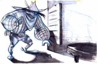
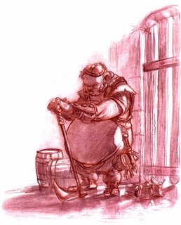
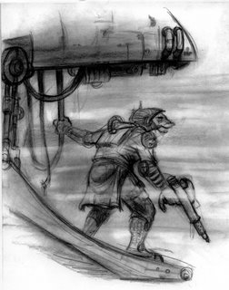
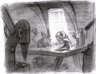
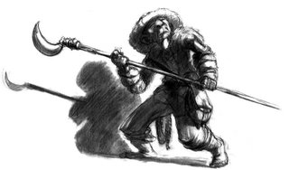
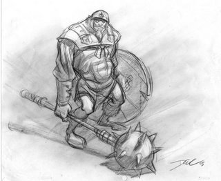
Well, I first have to figure out who the character is, what is the archetype? Is it an evil vicious snogbeast who preys on little children who hide their vegetables by giving them to their pet hamster or is it a fragile quiet, yet potentially volatile, elderly librarian who swears she invented the dewey decimal system. Once I figure out who the character is I address those traits in shapes indicative of the character as well as appropriate posing and the right expressions.
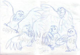
For instance I usually start playing w/shapes using a blue col-erase pencil and stay loose, drawing w/a lot of energy and pushing shapes where possible. At this stage I tend to figure out the problems w/the design so as to avoid things like volume redundancy, twinning and poor weight shift. It is @ this stage that the character starts to breathe a little bit. Throughout this process I will turn the paper over and hold it up to the light b/c from the rear you can see what is really working and whats not. Sometimes the balance is off or certain shapes aren’t working, and sometimes the dynamics of the arm are off such as the points of articulation are uneven or in the wrong spot. The stronger and more experienced I have become the quicker this evolutionary process is. After that I usually go over the design once more w/a new piece of 12 field animation paper on a peg board to clarify the shapes,forms and design elements
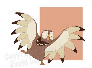
If the character is job, and/or task related. I may next proceed to add color if I have time to develop or if it is even necessary, but in the world of TV animation production there is no such time so I must proceed to clean up. However, if it is development I like to splash in some color to strengthen the appeal, maintain the art direction I would suggest, and increase my success rate for approval by the executives and director.(You will all learn about the approval process in due time….I wish you luck w/that…. He he he..)
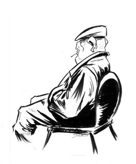
With clean up, I tend to use ink b/c it scans easily and there is less pencil dust. On stylized shows that tend to be more cartoony there is usually some sort of thick line or thick to thin so I will use a brush pen, usually a Staetdler versus a Tombow b/c the Tombows tend to lose their shape rather quickly. Sometimes I will use a Pentel Fountain pen but those have been discontinued so I tend to avoid breaking into my personal stash. When it is a thin line I use a very particular Korean made pen, unfortunately I don’t know the name, that is a 0.3 size. I avoid the commonly used Micron pen b/c it wears out quickly and the tip becomes misshaped. One important thing with cleanup is that the character tends to lose energy that was achieved in the rough stage so I aim to make the design better in the cleanup stage, not just a cleanup line but a stronger line.
What do you think really helps you out in designing a character?
Well, many things help such as knowing exactly what the director wants and/or production. This encompasses things like style, character, and the relationships of the character. Versatility is another thing that really helps. By being versatile I can draw in many different styles, basically being able to design in any way the production or project calls for. Also, b/c I have strong fundamentals I am able to help make my characters believable by giving them weight, strong gesture, attitude, and volume. Also as a designer you want to get into the character’s head, what is his/her, or its, story. This really helps you in understanding the character and therefore can communicate such aspects in the design.
From your own experience and maybe from some people that you know, what should we put in our portfolio and what should we not?
I have always been told that less is more. You really should only put your strongest work in your portfolio…. For instance you could have over a dozen really strong designs, but if that 13th design is weak it wipes out all the strengths and positives of your other work. This will most likely cause you to be passed over when being considered for work. I am actually reviewing portfolios now and I have seen some w/really great work but then there will either be too many drawings to review turn through or quite a few designs that are awful which signals to me that this person is not the right one for the job. So, like I said, less is more.
On a more specific level as you apply for design jobs be sure to include several designs that show a wide range of styles, versatility is key. Also, maybe a page or so of one character drawn in many diff poses, showing the key story points of the character, who the character is. It really communicates your strengths in trying to figure out the character and developing the design. Many people can draw a really cool design from one angle but only the best can draw that character in every angle, numerous poses, and story sketch ideas. Be sure to show some cleaned up characters, maybe some in color too but if you are not strong in color don’t do it, it will hurt you. Also,, have model sheets in your portfolio. A really good turn goes a long way. Add your figure drawings and life studies in the back b/c it is important but should never be the focus of your portfolio. If you are strong in life drawing it will show in your designs.
What are some of the things that you have worked on?
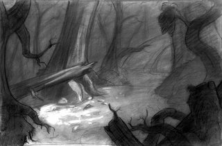
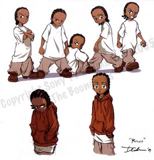
My first gig was Polar Express. I got to work with the visual effects supervisor Ken Ralston, you may know him from the Star Wars movies, yes that was a great experience. I did the concept designs for most of the animals in the movie. I also did visual development for Open Season, Sony Pictures Animation first animated feature due out in 2006. As well as Surf’s Up but only in the early stages before it was greenlit. I then went on to work @Sony TV Animation on Stuart Little 3, (yes there is a 3rd one;direct-to-video not yet released.) Most recently I was a designer on the Boondocks series which recently debuted as the highest rated cartoon on Adult Swim. It is causing waves because of the risqué subject matter, but the look is wonderful and a really great show at the same time that I am very proud to have been a part of. However, I left that show after Cartoon Network offered me a deal to be lead designer on a new show called Class of 3000 with Andre 3000 from Outkast, I came up with a brand new style and I am proud of my work so far.
I also developed 10 original characters for Avalanche Bay Water Park, an indoor water theme park in Michigan. It is quite flattering to see my characters on large billboards and walking around in costumes and such. I will be doing a children’s book for the theme park shortly.
I have also freelanced for Disney on several projects including the Tinkerbell movie and several other development projects.
Is there a character design you have done that you are most proud of?
Well, you are only as good as your last drawing. So I would have to say I am most proud of the characters I am doing on Class of 3000. However, I am also quite proud of them b/c stylistically it is so different then anything I have ever done so it is a lot of fun for me. I am also proud of the work I did on Boondocks b/c I probably designed about 500 characters for that show. Once I did 300 characters for one episode!!!! Can you say too many??? Regardless, I am proud of it b/c I turned out some great characters very quickly.
All in all, I am proud of everything I have done b/c I give it my all on each and every design I do. I must maintain the highest integrity when it comes to my craft.
What are you working on now? (If you can tell us)
As I mentioned above I am working on the Class of 3000 for Cartoon Network. Unfortunately that is really all I can say @ this time as the executives are trying to keep a tight lid on everything b/c it is still so new.
Where is the place you would like to work if you had a choice?
Oh boy oh boy…I would have to say Pixar, b/c they really are the kings in the industry right now and from a story standpoint they are the best.
Who do you think are the top character designers out there?
This list could go on forever…..
Marcelo Vignali who is a top notch feature level designer, as well as my mentor and friend. Steven Silver, a good friend and we all know he is one of the best. Ben Balisteri, I only know him through his work. Jose Lopez, Kenny Thompkins, Rik Maki, Harold Sieperman, Glen Keane(the Beast that he did for Beauty and the Beast is one of the strongest designs ever….) Richard Chavez. Peter DeSeve. Jeff Matsuda, Lesean Thomas, Nico Marlet(sp??? Top designer for Dreamworks) Tony Fuscilli (sp?) Carter Goodrich and I cant forget Chen-Yi Chang(sp??)
How do you go about coloring the character, what type of tools or media do you use?
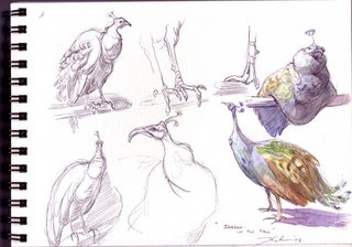
Well, I used to love using Prismacolor Markers b/c they are so quick and so bold. I would photocopy my designs onto color copier paper b/c that paper soaks up the markers the best with very little bleeding. However, over the years since working in production so much I tend to use good ol’ Photoshop b/c it is so easy to adjust colors for production purposes w/just a few clicks of the mouse. When I am doing study sketches in the field, like the zoo or coffee shops, I tend to use watercolor b/c it is such a loose medium so it keeps my drawings loose and expressive w/o getting caught up in being so exact.
What part of designing a character is most fun and easy, and what is most hard?
I think playing with shape is the easiest and most fun… I like to find a nice shape and try to make it work, creating nice design elements along the way like straight against curves, keeping the shapes appealing but still dynamic and attitude driven. I would say doing model sheets is the hardest. They are not really difficult for me but as a designer you have to be quite anal w/this task to maintain the volume and direction of the character, making sure the character lines up in each angle accordingly
What are some of your favorite character designs and least favorite, which you have seen?
I would have to say the work Chen-Yi Chang did for Mulan. Those characters had such beautiful flow and shape; so dynamic and so simple at the same time. He really brought some of the most striking elements of Asian culture into an animatable design. They are almost calligraphic. I am really not too crazy about the designs on the Simpsons, King of the Hill, Family Guy and American Dad. However, don’t get me wrong, they are great shows. Those shows are not about the design but about the writing. I admit they are some of my favorite shows. I enjoy them thoroughly from a humorously written perspective. However, as a designer they are unappealing to me, just a little too mundane for my taste.
What is your most favorite subject to draw? And why?
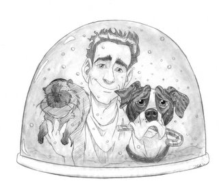
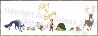
I would have to say animals There is so much character and personality in animals. I have taught animal drawing for several years @ the LA Zoo but I had to put it to the wayside once I started working full time in production. Also, there are so many different types of animals so the variation is exhilarating to me. In addition. the opportunity for shape exploitation is endless. Furthermore, they are quite difficult to draw and not many put in the time w/such a subject. I have and it shows. So the challenge is fun and it makes me proud to have such an artistic knowledge and drawing skill when it comes to animals.
What inspired you to become a Character Designer?
Oh boy, I really don’t know how to answer this. When I became interested in animation I was fascinated by so many things but I really owe it to you a few key people I met early on who saw my work and felt I had such a good handle on characterization of people and manifesting original imaginative character designs. These people were veterans so I really felt they were hitting the nail on the head when telling me this. Also, character designs are some of the most fun things to draw…. More fun to me then backgrounds and layouts. I loved a lot of Disney movies when I was younger so deep down I was always fascinated w/the characters more then anything and I think I was drawn towards creating my own. At an early age I would create my own characters and story lines even though I wasn’t very good. Now that I am able to do it for living I am quite ecstatic. It is the best job in the world,hands down!
What are some of the neat things you have learned from other artists that you have worked with or seen?
Different approaches is one of the best things I have learned from other artists. There is no way I can pinpoint just a few. I would say I learned the most from Marcelo Vignali, such as good shape exploitation, maintaining the integrity of the character and the subject. He also taught me how to really add “gravy” to my designs. When you have a well drawn design you can increase the appeal and interest by adding gravy…This may be things such as color or just a simple value pass with some tracing paper and a black prismacolor pencil. However, if the character is not designed well, the gravy will not hide such poor draftsmanship.
Chen-Yi Chang once said that you must respect your subject, gather as much reference as possible. Don’t just rely on your imagination or else your work will look the same everytime. I cannot tell you how important this is. No matter how experienced you are you should always do extensive research on your subjects b/c although you may know plenty on your subject you will find new ways to characterize that subject that you never even thought of.
What wisdom could you give us, about being a character designer? Do you have any tips you could give?
Well, I feel a lot of what I discussed in the previous answers addresses this question. However, I would have to say be open to many styles, good designers are never narrow minded, always increasing their vocabulary of styles by finding new inspirations and other artists to infer from. Also, once you become a character designer, keep drawing for yourself, always practice even if only a little bit now and then and never give up. You should try harder each time you sit down @ your drafting table and never be content. One more thing, never fall in love with your drawings because you can never take anything personal when working in production.
If people would like to contact you, how would you like to be contacted?
You can always contact me through my website:
http://www.davidsdoodles.com/
and my daily blog:
http://davidcolman.blogspot.com/
Finally, do you have any of your art work for sale (sketchbook, prints, or anything) for people that like your work can know where and when to buy it?
I recently came out with David Colman’s Doodles Vol.1. A comprehensive collection of my personal work from animal sketches to character designs. I put this out to increase my visibility as an artist. For this reason it is quite reasonable, you get a lot of bang for your buck.
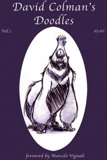
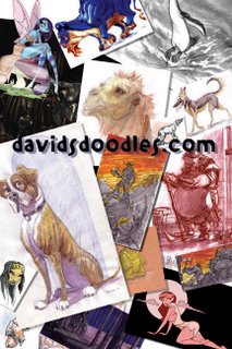
I also still have a few copies of my animal drawing manual I used when teaching @ the LA Zoo. These are both available through my website under the store link
http://www.davidsdoodles.com/store.html
I will next be exhibiting @ the Wondercon in San Francisco in Feb of 2006. If you are attending, please stop by @ the davidsdoodles.com booth.
I would also like to announce my first self published book that is currently in production. It will be a hardcover 160 page full color book due out in 2006. As of now the subject matter is undercover but check in w/me through my site for updates. This book is worth the wait!
CLICK HERE TO GO BACK TO THE CHARACTER DESIGN HOMEPAGE
Subscribe to:
Comments (Atom)

